Tuesday, December 14, 2010

Watercolor - "Egret Sunset"


This painting was a lot of fun, but I was pretty impatient with it in my excitement to see it finished. On some of the glazes I didn't wait until the one before was completely dry before I continued on. My hairdryer became my best friend for the next painting I did. What I would really like to do in the future is repaint the painting with the same drawing, because that was really fun.

Watercolor - James Gurney Emulation

This project was to emulate a watercolorist we admire. While James Gurney is not strictly a watercolorist, he uses them frequently for studies while out and about. I copied a study he did of a cow he saw while visiting a farm. You can read the whole story on his blog here. If you've never heard of James Gurney or visited his blog, it is a wonderful resource of artistic knowledge and learning.

Watercolor - Sea Turtle


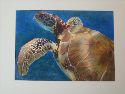
This painting was done using a watercolor technique called direct glazing. How it works is you paint the painting in layers of color. First yellow, then orange and red, waiting for each layer to be completely dry before moving on to the next. Up to red isn't too bad, because you're just working in warm colors and thinking about what the values will be like with all of the layers together. When it really gets interesting, and kind of scary at times is in the next layers which are blue and green. These layers are great for darkening darks. The blue is probably my favorite because it's like a rainbow in every stroke! The green is good for toning down reds. I had to do that quite a bit on the shell of the turtle before it was really finished.
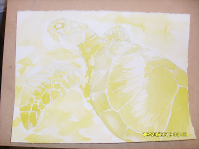
I really liked doing this process and I want to do more with it in the future. Here is a picture of how I did the yellows.

This was painting in yellow where ever I saw yellow and using darker yellows where I knew the values would be darker later. It's a really different way to think about painting, but it was fun. I definitely need more practice at it.


Prints Available


And this is the final result! I had so much fun!

Thursday, October 21, 2010

Watercolor - Glazing Colors Exercise

This exercise shows how you can create different colors by glazing(A wash dried + B wash). My class did a little different format than I did. The approach I took was something I saw on James Gurney's blog(the creator of the Dinotopia books). His watercolor exercise is here. The diagonal colors are the pure pigments and the two sides show how the colors combine as glazes and the differences between having each color layered underneath and on top of all the other colors. Under each swatch there's a little formula telling what is there. Color A is the color underneath and color B is on top. A + B = what you see. It was great fun!!

Watercolor - "French Horn Portrait"

First off, sorry about the dark shadow from the mat board. It's not part of the composition. :)

The assignment or purpose of this painting was to gain experience with painting darks with watercolor. I got my reference and inspiration for this painting from my friend Jessica Willey. She gave me permission to use pictures from her blog for photo reference. You can visit her blog here and her portfolio blog here. This reference is from a set of portraits Jessica did for a girl who play's the french horn. Painting the girl was fun with the interesting lighting going on and I'm really pleased with how she turned out. The large dark wash in the background was harder for me, but with time and some happy accidents/tender mercies, it turned out great!

Prints Available

Wednesday, October 6, 2010

Watercolor - Texture Experimentation

In preparation for our next assignment, a painting structured around textures, we got to experiment with making whatever kind of textures we wanted. My favorites were saran wrap, rice, and twisting a stiff fibrous tube(I don't actually know what it is). Here are some close ups.

This close up has rice, cork, shower poof, that fiber tube thingy, salt, garbage bag, and crumby paper towels.
This one is a little fuzzy, but it's a close up of how the saran wrap turned out. I like it a lot.

This one has sea sponge, the fiber tube twisted on it's end, and basically those same things repeated in a few "squares." Oh look! There's the saran wrap again. ;)

I'm not sure what I'll do for the texture painting, but I want to do something with either saran wrap, the swirls, or rice. We'll see!

Just how do you paint on those Spori desks?


Very carefully. ;) Having snacks on hand helps too.


Watercolor - "Pineapple Limes"


Prints Available

This is my first finished real watercolor painting. As a class we worked from the same reference material that our teacher did for a painting that is currently in a local gallery. So it was a master copy of sorts, but it was so interesting all of the different directions people ended up with. It was a very challenging piece, even frustrating at times, but it taught in experience faster than traditional teaching could have alone. I'm quite happy with how it turned out.

Watercolor - Stayers and Spreaders


More getting to know my pigments. The idea is to lay down a pigment, let it dry, then go over it with a wash to see if the pigment stays put or spreads through the water. Very important to know and incorporate into watercolor painting. I think I didn't let the colors dry all the way, because colors I know to be stayers were acting like spreaders, like my cerulean, and spreaders were acting like stayers, like the phthalos. C'est la vie.

Tuesday, October 5, 2010

Watercolor - Three Washes


This assignment was our first introduction to watercolor washes. It was definitely a learning experience.


I liked the middle one best. It's negative painting on an indirect graded wash.

Watercolor - Color Experimentation

This was the first assignment from my watercolor class this semester. Part of learning how to effectively use watercolors as a painting medium is understanding certain traits that they have. This exercise was to show opaque pigments, which show up better on the black stripes, transparent pigments which rub away with water really well(thus the white line), and staining pigments which don't rub away as much. It was a good exercise to get to know the colors on my palette.

Thursday, September 23, 2010

Character Design

This is my initial design for the protagonist for a fairy tale I'm working on in my Narrative Illustration class. She has a voice that can heal people, help things grow, and even "move mountains," but she is so self conscious that she won't sing for anyone. The story follows her transformation to value and love sharing her amazing talent with those she loves.

Thursday, August 12, 2010

IF - Caged


Prints Available

This is my very first Illustation Friday post that is not only in time to be officially submitted, but I feel like it's pretty well finished. Maybe when I come back to it some time after some critiques I'll see lots of things that could be better. Either way, I'm very happy with how this turned out! What do you think?

Monday, June 28, 2010

Be Positive


This is going to go on the girl's camp t-shirts for the girls in my ward. My mom-in-law is the YW President so she likes to involve me in these sort of thing, which I love! It's just fun to contribute to the quality and the awesomeness of their t-shirts for girl's camp. I really, really like how this drawing turned out. But that might be a downside when it unmotivated me to finish the rest of the illustration. :) Luckily, Becky ended up just wanting the girl and they'll have an activity for the YW to paint the rest of the simple illustration themselves so it'll be unique and awesome. :)

And this was just some simple coloring for fun. :)

Monday, May 3, 2010

Not-Birthday Painting

I painted this on my birthday, hence the title of the post, it not being my birthday anymore and everything. Hooray 22!! That morning I went into the local school and sat in on the art class. I thought they were doing figure drawing, and I wanted to practice. Alas, they had finished the figure drawing part of their class just the day before. No fun. But it turned out ok, because I just stayed and painted on my lappy until the batteries died. I must admit, I felt like a bit of a showoff/celebrity in the classes I sat in on because many of the kids and the teacher were impressed by the wacom tablet and what I was painting. It's not really finished, but I kinda like it how it is. Enjoy!


Wednesday, April 7, 2010

The final cards!!!


Prints Available


Prints Available


Prints Available


Friday, April 2, 2010

Wolfen Cards - illustrations

These are illustrations for my final project in my intro to illustration class. They're for a group game we like to play called Curse of the Wolfen, or more informally Wolfen. It's a really fun game and I'm toying with the idea of getting into some game illustrating some day, so it's been a good project.


The Psychic
The Wolfen
The Human

Tuesday, March 16, 2010

Steampunk/victorian sketches


This week's theme in illustrative figure drawing is steampunk. It's been really fun so far. Monday is our more short poses day and so tomorrow we'll do more longer poses. These were my favorites. I really like the top guy. It would be such a cool illustration! Some day, some day. :) I didn't know what steampunk was before, but now that I know what it is, I love it!!!

Monday, March 1, 2010

High Fasion figure drawing


These are my favorites from my figure drawing class today. The style we were going for was high fasion(fa-si-on)! Extremely long and skinny. It was so much fun!! My favorites are the blue one and the purple one. The blue one was a gesture drawing from class that I expounded on tonight. SOOOO much fun!!!

Finished Sabriel book cover!!!

This was so much fun! I love all the reflected light. Something like this is what I wish the book cover would have been like. But that's my world. :)

Monday, February 22, 2010

Way fun figure drawing!!

This was a lot of fun!! We used laptops and wacom tablets in illustrative figure drawing today and this was my best one today. It was such a fun drawing, and I painted it at home for fun too. Just some simple color, and it's a bit desaturated from the original file as viewed in photoshop. Oh well, still cool! :)

Thursday, February 18, 2010

I love Sabriel!!!


So, I love this book and it is so fun illustrating my take on a cover for it. I started with my darkest darks, so when it came to highlights I think my eyes were toned down. The highlights are really what it needs. Here the color comp for the same thing.


I so excited for the green under lighting! It's really coming in the direction that I want it to.

Thursday, February 11, 2010

Spot Illustration page layout

I need to learn a lot more about illustrator. Fiddling with the text was tricky, but it came out okay for my first time doing a page layout. There are probably tons of little things that bug graphic designers, but I did my best and it was fun. Eye disease and pink go really well together. :)

Monday, January 25, 2010

a post for posts sake

I haven't been keeping up with my weekly post goal, and thus... the firepillar post was born! Just a sketch I did over the summer.
Contact me for pricing on prints or originals.