Saturday, February 25, 2012

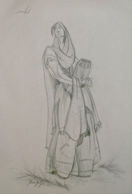
Figure Drawings

I'm in an illustrative figure drawing class.  It's been so much fun!  It's been great exploration and it's so liberating to draw, express, and experiment with the lines, proportions, gestures and everything.  The models and costumes have been great.  It's so wonderful to work from such fantastic reference.  Our class has also started a blog to post the pictures we take in class for reference later on.  If you'd like to be inspired and work from some great reference, you can check it out here, advancedfiguredrawing2012.blogspot.com.   My favorite drawing I turned in before I took a picture.  It's a finished drawing I refined out of the fourth drawing in this list.  It was just such a great pose and gesture for me.  I hope you enjoy. 


Tuesday, December 13, 2011

Color II - Triptych Final

So, this is my final for Color II.  It turned out much better than I could have done on my own.  It is the product of best efforts, wise counsel and critique, and grace.  Because considering stuff and things, and how I handle such stuff and things, there's no way these could have become what they are without my Heavenly Father's help.  I know that my insignificant efforts and pursuits in the grand scheme of things are important to Him because they are important to me.

I hope you enjoy these three pieces as much as I did.  What would make them more enjoyable for you?


Sheesh, did you know it's really hard to line up pieces horizontally?  Give us an inch of really nice features and we whine and cry that we didn't get a mile.  Thanks Blogger for nice updates for putting images in posts. :)  And thank you for visiting my blog.

Monday, November 28, 2011

Color II - Pallet's Final

So these are the final pieces.  They aren't extremely different from where they were in the last post, but I've got to put up the finals because I'm so happy with them.  I've gotten a lot of great feed back on these.  It makes getting to class late ok, and make makes me excited to keep going.  The process was such great learning experience.
Note: they are a bit desaturated upon upload.  Weird.


Prints Available


Prints Available


Prints Available


.....I hope you enjoy the finished product!....

Wednesday, November 23, 2011

Color II - Pallet's WIP

Due to a wonderful break to celebrate Thanksgiving holiday, feed back on current projects is painfully limited.  Such is life.  So, if you see this and have a few minutes to appraise what I have done so far and comment your suggestions I would be ever so grateful!  It's good for digestion. :)

This assignment was to find 3 pieces of art that had inspirational color.  We then broke the color in those pieces into simple ratios to more easily see how they composed the color and why it was so attractive to us.  The final part of the project is to create our own pieces with the color ratios of our inspirational pieces.  It's a great process that I'm going to have to practice more.  Being inspired by others is a great way to learn from them.

Here is what I have so far....


I am at a work in progress stage with these, some more than others.  I have things I plan to do, but I'd really like to hear from you.  What do you think are the most important things for me to adjust, fix, and refine on these pieces?

.....Thanks!.....
ps: that took long time to get to look good in the post!

Tuesday, November 22, 2011

Illustration for spread 3 in WATERCOLOR!!


I finally did it!  I did one of my BFA illustrations in watercolor!  I really enjoyed the planning and painting process.  It was really nice to be able to see the whole painting, step back, and focus in to work a little smaller.  On my previous digital pieces I'd have to zoom way in just to see anything at full scale, and then I could only see a small part of the whole.  It was really nice to see the whole thing progressing at the same time.  It makes me wonder just how big a difference a nice big screen would make in my
 . . . . . . . . . . . . .digital work. . . . . . . . . . . . 

Interesting way to end a paragraph. :)

When I painted it I didn't want the saturation to get out of control because watercolor can be very vibrant and I wanted the piece to harmonize.  Now that it's finished I want to do some touch ups to saturation.  Mostly in the sash, flowers, and the hat.  
I did do some tweaking to the darker darks, but I'm not sure if there is enough to get a good sense of perspective in the foreground.  Your thoughts?

PLEASE CRITIQUE!
Trust me, I like it. :)
Contact me for pricing on prints or originals.